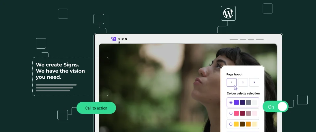
Ensuring the best possible user experience (UX) for your audience is a top-of-mind exercise when building a website.
It makes a successful digital platform, whether a website or progressive web app, and taking it to its full potential can be achieved when combining UX and design systems together. How so?
Breaking down UX advantages
First of all, UX isn’t just about making the appearance appealing. It’s an essential way to ensure that the visitor’s surfing journey around the website is seamless, with the main aim being that a user can find exactly what they’re looking for in the simplest way possible. Crafting a navigation that’s easy to use leaves a positive impression, whether that be through pop-ups, or clear call to action buttons.
Simple UX implementations are imperative for marketers to best understand their customers. By tailoring related web content to their wants and needs, the chance for increased click-through rates is higher, providing better grounds for conversion rates and the goal of reaching ROI. UX also takes away manual workload from certain job functions by creating efficient processes between web elements, so that precious time and resources can focus on the end customer and lead generation engine.
Another benefit from good UX is that any changes in the backend positively affect the performance of the frontend. A smooth-running site without breaking lets businesses continue to focus on enhancing the digital experience for users rather than troubleshooting.
Where design systems come in
Design systems are effectively ways to scale web elements, as they collect them all into a single source of truth. They make multiple pieces of your website or application fit together and interact in harmony.
With that increased consistency, this is crucial for UX success. Processes between the frontend and backend are smoothed out, making sure that the website experience remains streamlined and easy to navigate through. When components work in tandem, the user’s understanding of the platform is greatly increased, building trust and ensuring they return to find out more.
With that in mind, UX and design systems go hand-in-hand to engage interaction for these five reasons:
- Ultimately, UX matters. It can make or break a user’s initial impression of a website or web application.
- Design systems ensure that all web components work together smoothly, bettering the resulting user experience.
- Tailoring UX can help to increase click-through and conversion rates, leading to maximum ROI impact.
- In the long-run, processes, workload and time are all saved from implementing UX considerations.
- When UX and design systems combine, components are consistent and personalised to users, who are more likely to return.
Using UX and design systems together can be a win-win situation. Talk to SiteBox to find out more about implementing them for a seamless digital experience, or we can put you in touch with one of our partner agencies.


