The e-commerce market is an all-consuming landscape for shoppers.
With most potential buyers resorting to stores rather than online in person, for an easy hassle-less experience, those stores must provide a webpage that’s beautifully presented, easy to navigate, and personalised according to a user’s marketing activity.
And with both customer and transactional data being shared, compliance and security are two large factors beyond a web experience that’s attractive and full of the latest content to drive conversions. WordPress is a powerful hosting platform to handle security and performance, and with its own catalogue of themes and plugins, these e-commerce brands have taken their online storefronts there to get them to the next level.
IKEA
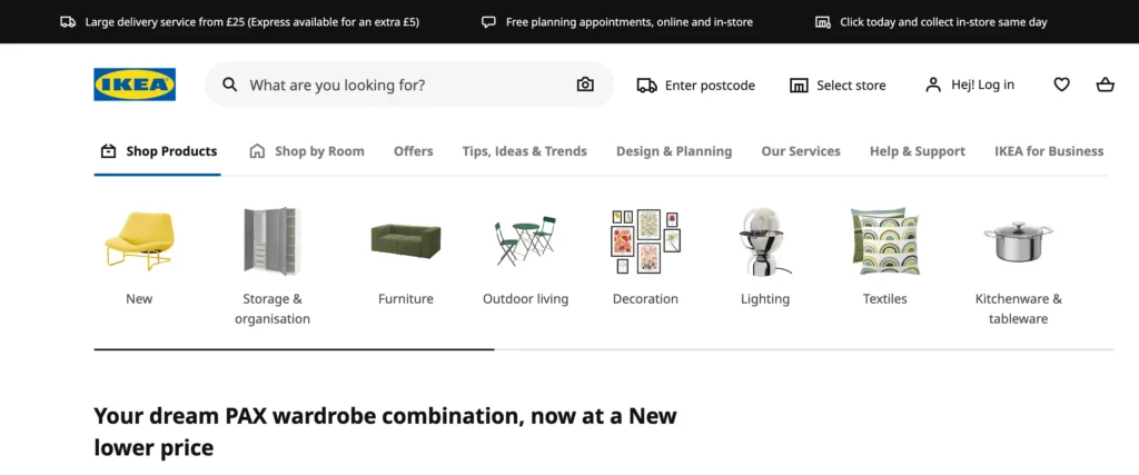
IKEA’s WordPress-hosted store is both sleek and functional as the famous furniture it sells. The company’s well-known commitment to accessibility is reflected in its easy-to-navigate site, where every customer can design their ideal living space with a few clicks. Product images are crisp and bright, able to be scrolled through in carousels, or found in a handy ‘by room’ CTA. The website design conveys simplicity and modernity, and drives social media engagement with Instagram widget plugins to formulate a buyer community spirit, with only images.
Root Science
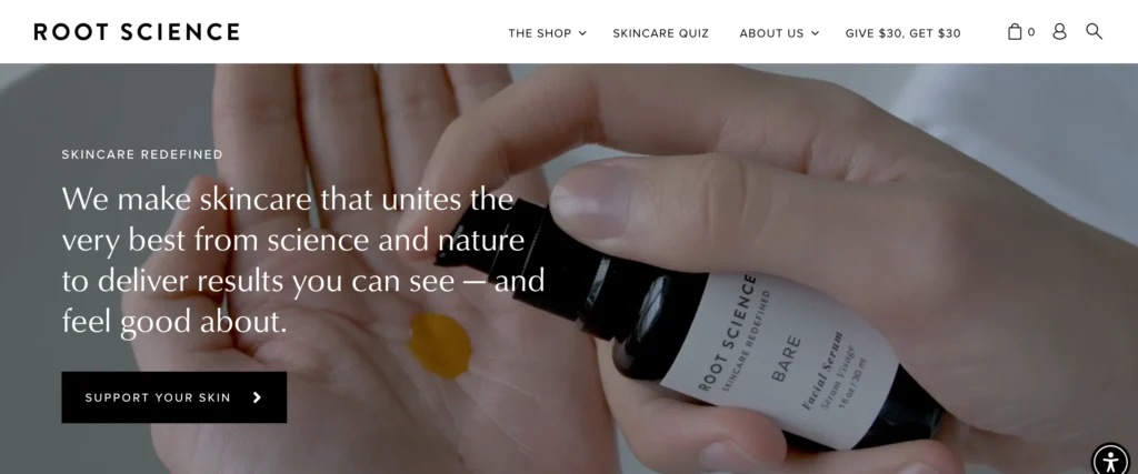
With an awe-inspiring design and a focus on the sustainability it stands for, Icelandic skincare company Root Science’s site marries sleek visuals with a seamless shopping experience. The navigation is simple, allowing users to find the right product for them ‘by category’ or ‘by concern’, and its interactive Skincare Quiz aims to use data to personally recommend the one product they shouldn’t be without – an excellent way to drive potential leads to a conversion.
Target
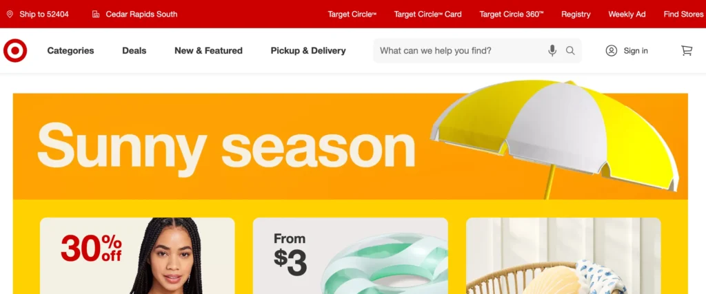
Target’s WordPress-powered online store is built strongly in the brand’s image while visually engaging enough to resonates with its diverse customer base. With its feature to save products for later, it helps shoppers track back to favourite finds before they add to their cart, letting them browse easily at will. The search bar features dictation via a user’s microphone, boosting accessibility, and UX for shopper on-the-go, as they so often are!
Roberto Coin
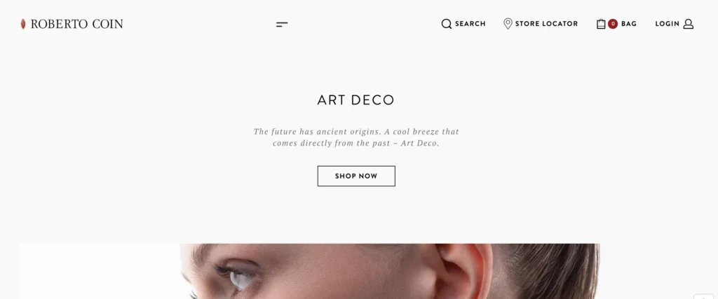
Luxury Italian jeweller Roberto Coin’s WordPress site embodies opulence and elegance in every pixel, with high-quality visuals dominating the page, but allowing white space to make it feel not too convoluted. Its splendid mega menu opens out fully onto the main page to put the power of browsing by type, or stone, in the user’s hands. It’s search function is similarly minimalist and smart, fine-tuned to reflect the superiority associated with the brand.
Vic Firth

Both design and function play out together in perfect rhythm for drum manufacturer Vic Firth’s online store hosted on WordPress. Vic Firth taps into a highly specialised market, with its featured image carousel link to shopping essentials in a brash, colourful manner. The mega menu and toolbars provide a multilayered experience allowing drummers to quickly find the products they need. And with the integration of high-definition videos featuring renowned artists and their craft, as well as educational how-tos, this site delivers on the tricky aspect of community engagement.
Etsy
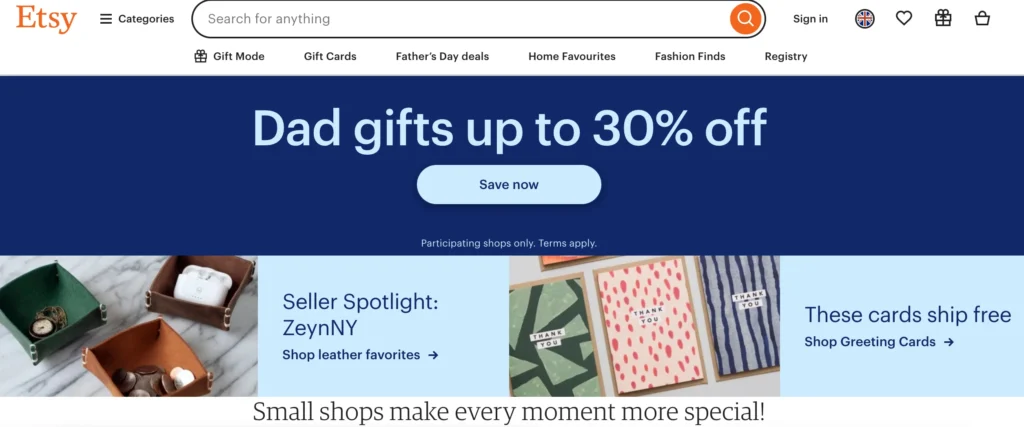
Spotlighting a collective of artisans and vintage enthusiasts, Etsy’s community-driven marketplace is a testament to WordPress’s flexibility. The mega menu on their site unfolds an endless trove of handcrafted delights, providing a user experience that is both personal and expansive. Similarly, it’s accordion FAQ feature keeps potential traders in-the-know for how the marketplace works, ensuring that the shopping experience is as informed as the site’s playfully creative design and content.
Walmart
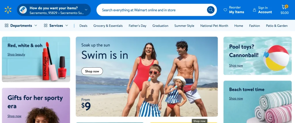
Walmart, a globally recognised retail giant, has seamlessly integrated its extensive inventory with the robust features of WordPress. Despite the vastness of products, Walmart’s website boasts a clear design that’s easy to navigate and wholly consistent with their sunny brand image. The performance is high, with impressively speedy page loads that can even handle its large volumes of product data without a hitch.
Porter & York
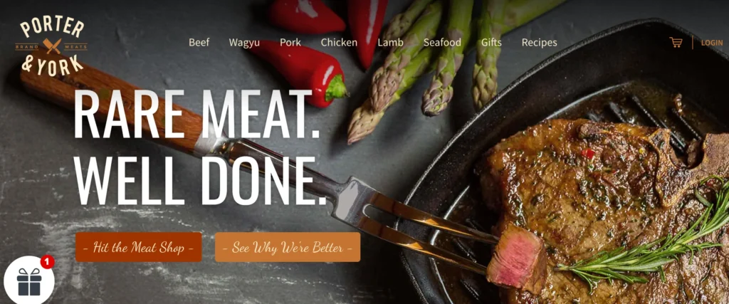
When it comes to delivering a delectably easy site to consume, meat purveyors Porter & York has the recipe down. With quality images and animated content, the WordPress and WooCommerce powered site both showcases and informs about their products succinctly, without the elements slowing the page. The navigational experience drives users to whichever product they desire straight away, and an attention-grabbing pop up helps to draw in shoppers with promotional items they could benefit from.
Björk
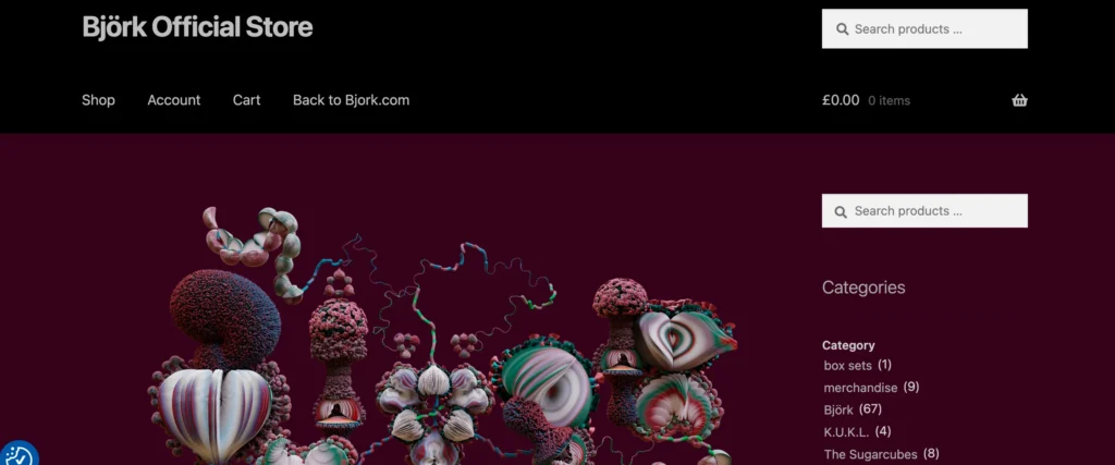
Built using the WooCommerce plugin for WordPress, Icelandic’s enigmatic visual artist and pop legend Björk’s own site matches her fun, abstract nature that, like her music, still remains accessible with its smart, concise navigation options. Focused on artwork, users can browse through a select range of categories and all the products are featured on one page. It’s a great example of simplified toolbars and buttons, with no overload of options, letting the look and feel drive a pleasurable shopping experience.
Samsung
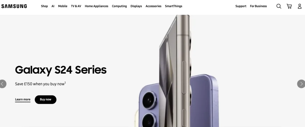
Samsung’s e-commerce site is a showcase of cutting-edge technology for both their sleek products, and for web design. The site stands out for its crisp images and immersive video content, allowing new customers to experience Samsung’s devices up close. The footer contains every page that a user would need to specifically seek their trusty piece of Samsung equipment, and stresses commitment to sustainability. Continuous optimisation ensures fast loading times, reflecting the speed and performance that Samsung’s brand promises.
The e-commerce space may fiercely competitive, but these ten WordPress-hosted sites prove that multimedia, and nifty UX design features can set one business apart from the rest.
If you’re looking to leverage the tools and flexibility of WordPress, SiteBox can help you get the most out of the popular hosting platform. Talk to us to learn more.
